Yallfest
Elevating and Rebranding a festivalRole
Lead DesignerIllustration, Typography, MarketingSkills
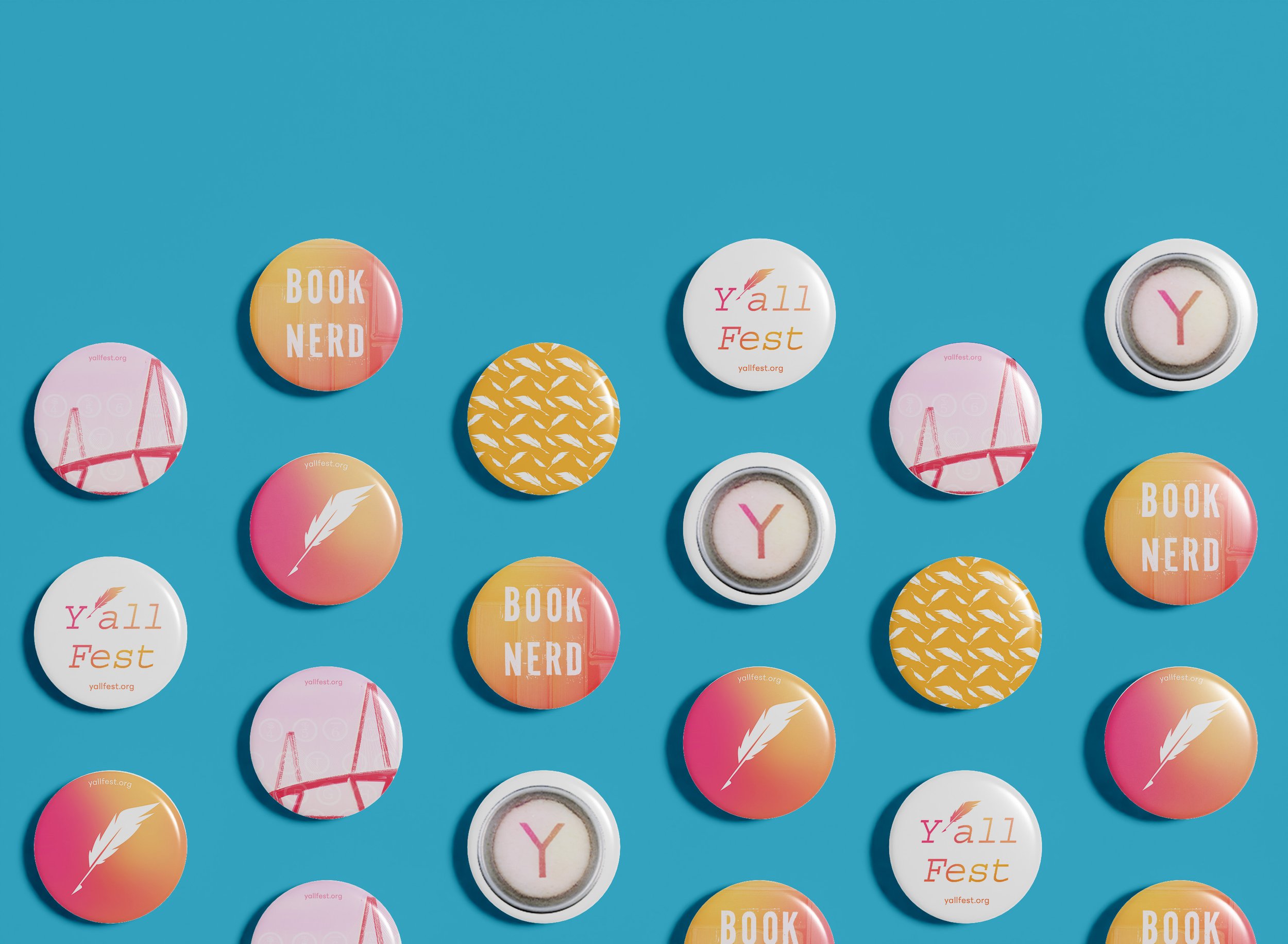
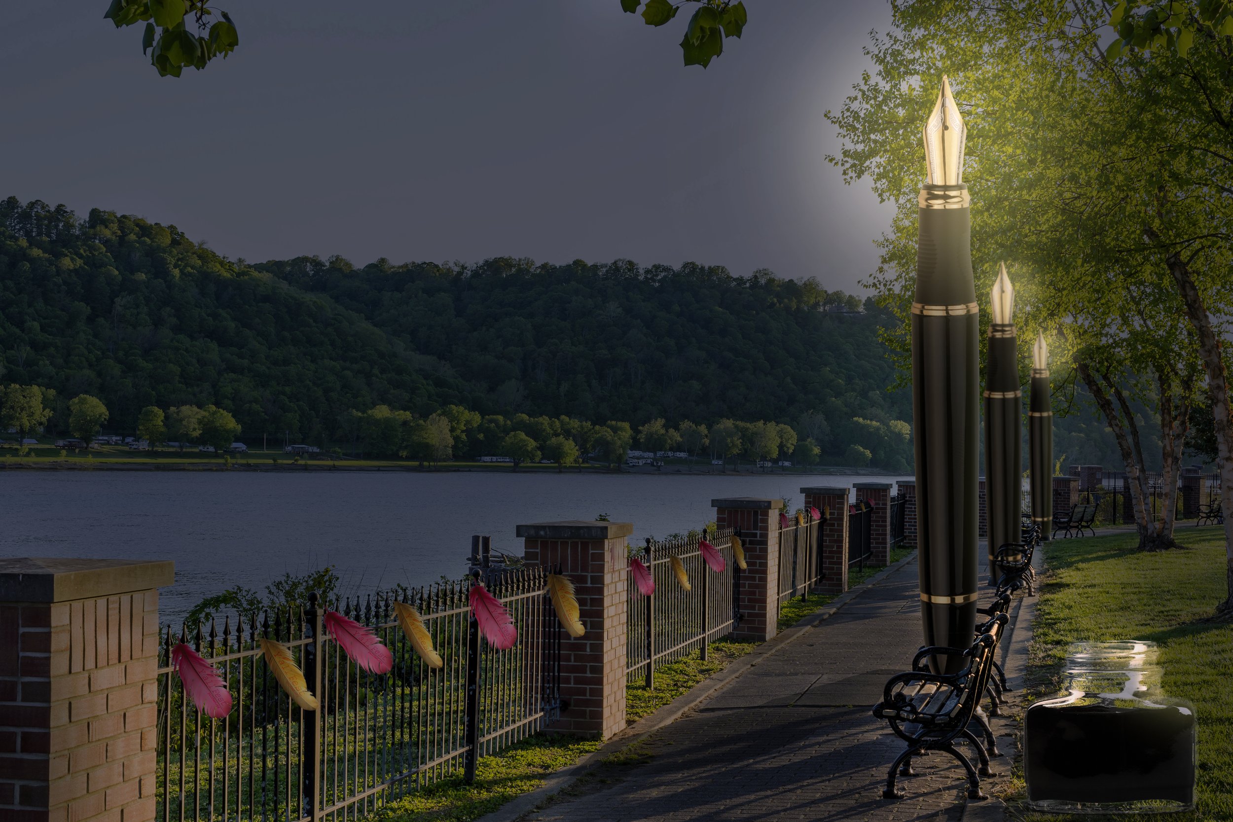
The rebranding of YALLFest was designed to elevate the festival’s identity while paying tribute to the evolution of storytelling and the rich historical essence of South Carolina. The updated vision celebrates both the vibrant world of young adult literature and the cultural heritage of the region, creating a dynamic and inclusive space that bridges tradition with modern creativity.


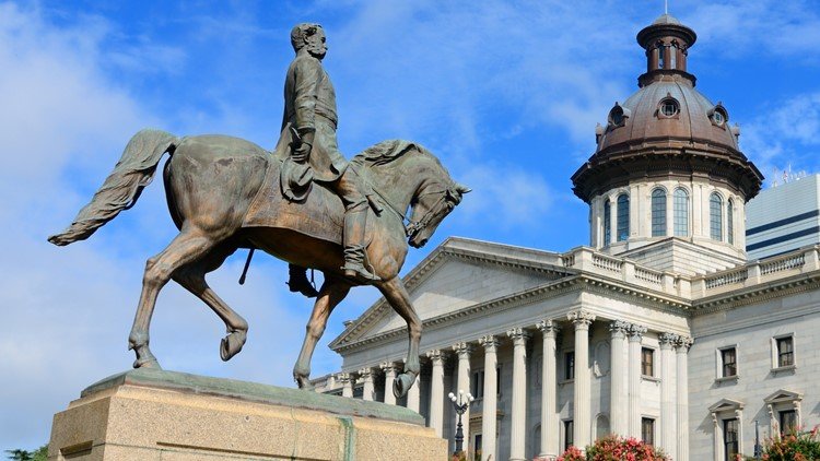
Yallfest Celebrates and honors young adult literature. Mission is to inspire the youth and build a new generation of diversity writers ready to tell their stories.The community of Charleston, South
Carolina hosts the largest young adult literature festival in the south.
FESTIEVAL RESEARCH
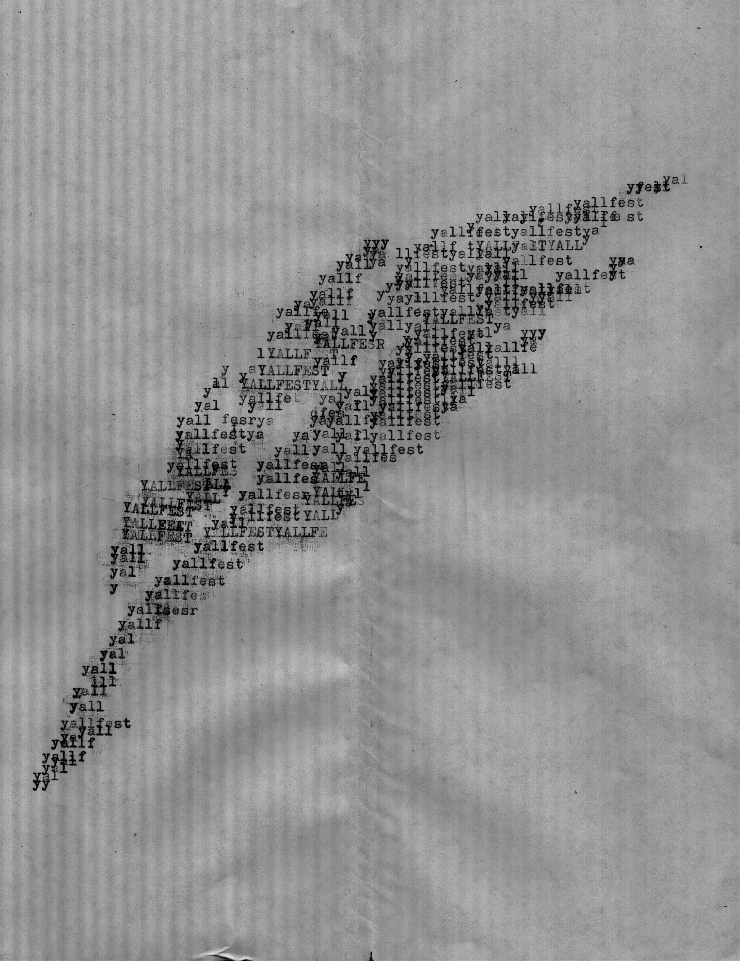
In the exploration of the wordmark, I drew inspiration from the traditional tools of writing pen, quill, and typewriter. To bring authenticity to the design, I experimented with a real typewriter to create raw, tactile typography that felt rooted in history. Incorporating a quill into the concept was essential to pay homage to the timeless art of pen-and-ink writing. This approach bridges the legacy of past generations of writers with the vibrant, contemporary voices celebrated at the festival, creating a wordmark that honors both tradition and evolution in storytelling.EXPLORATION

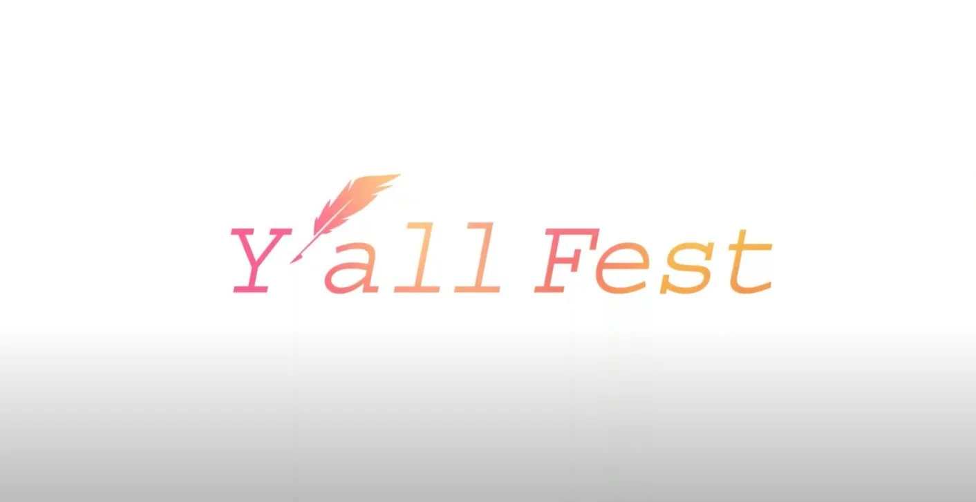
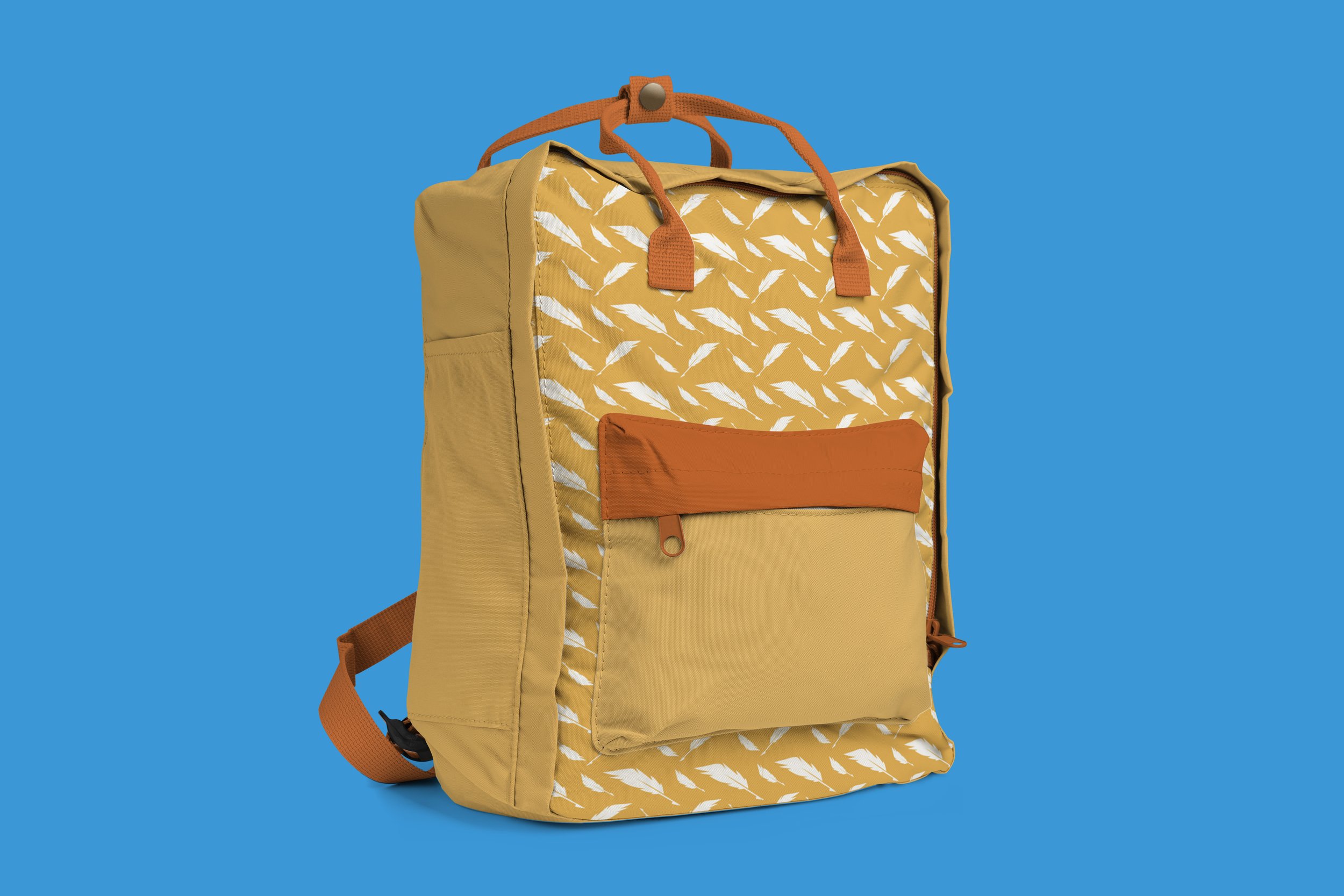
The final logo mark combines typewriter-inspired typography with a feather as the key visual element, creating a striking contrast between the quirky, modern vibe of the festival's name and the traditional tools of writing. This blend bridges the gap between generations, celebrating the old ways of storytelling while appealing to a young adult audience, perfectly encapsulating the festival’s mission of uniting the past and present of literature.FINAL LOGOMARK
POSTER EXPLORATION
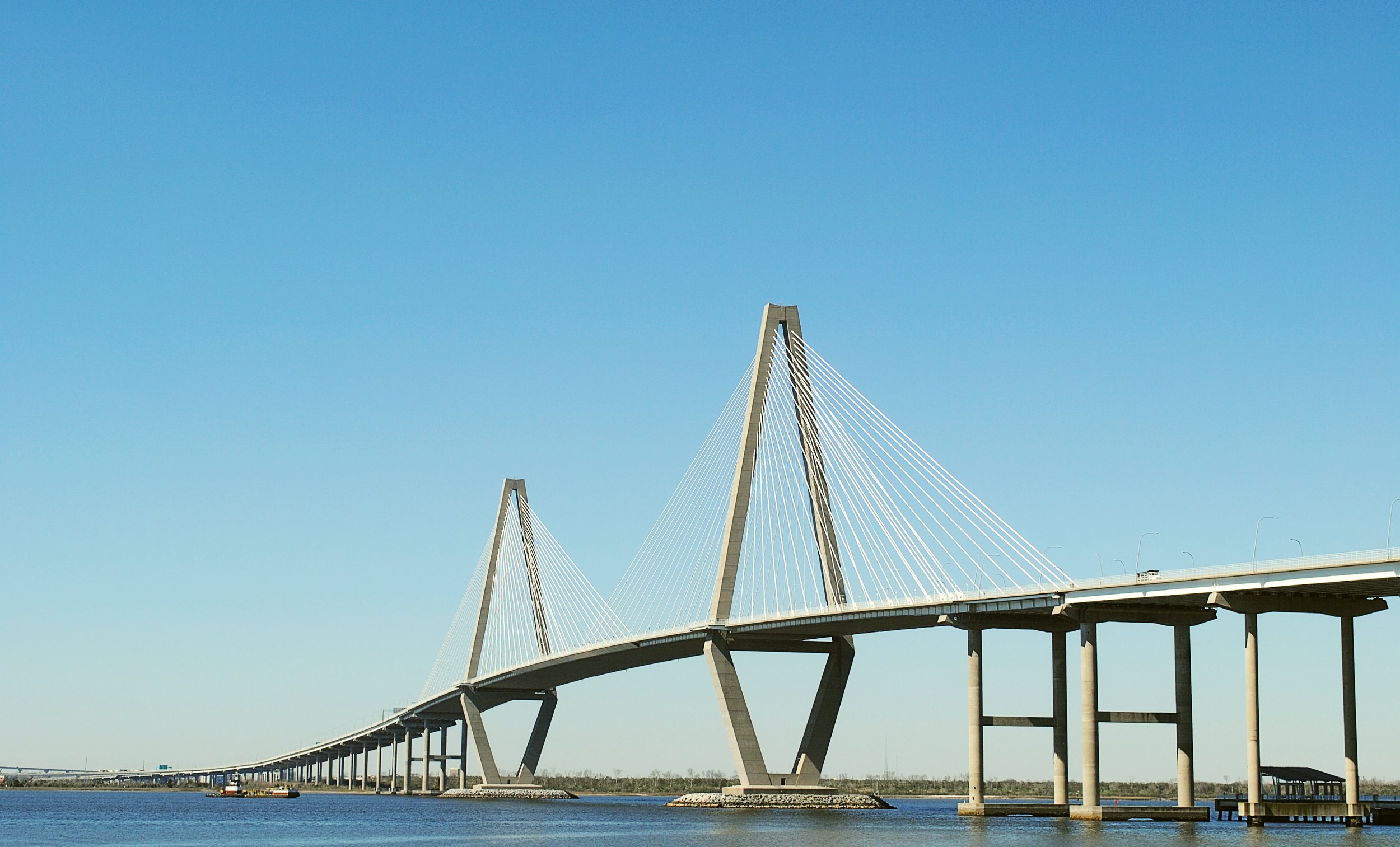
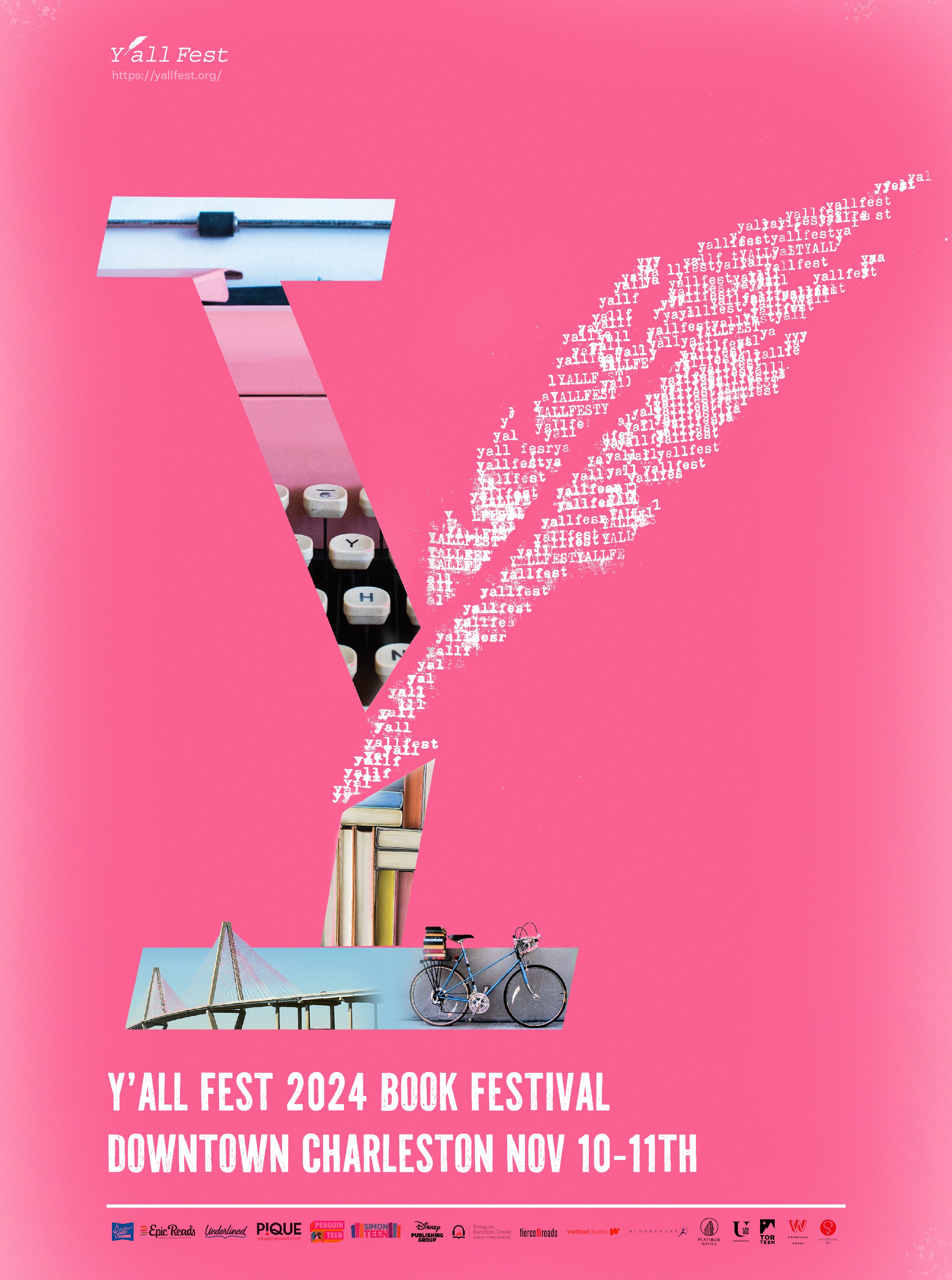
Design inspiration was from the typewriter, using its tactile textures to evoke a sense of history and tradition. The feather icon from the logo mark was incorporated, with the words "YALLFest" shaped into a feather graphic created entirely using a real typewriter. To enhance the historical feeling, South Carolina’s iconic landmarks were added, further grounding the design in the region’s rich cultural heritage. 


![Poster Ideas YallFest drafts 2 [Recovered]-02.jpg](https://images.squarespace-cdn.com/content/v1/673e7b9a9633c8767bbb4091/f63858ff-61a9-4c7c-9f8d-00519e7c1183/Poster+Ideas+YallFest+drafts+2+%5BRecovered%5D-02.jpg)
![Poster Ideas YallFest drafts 2 [Recovered]-01.jpg](https://images.squarespace-cdn.com/content/v1/673e7b9a9633c8767bbb4091/c649c4eb-b7f5-44ad-81ce-09876e7e23a0/Poster+Ideas+YallFest+drafts+2+%5BRecovered%5D-01.jpg)
![Poster Ideas YallFest drafts 2 [Recovered]-03.jpg](https://images.squarespace-cdn.com/content/v1/673e7b9a9633c8767bbb4091/1c64c68c-f487-4ba6-92c0-5ef3e4f4dbcf/Poster+Ideas+YallFest+drafts+2+%5BRecovered%5D-03.jpg)
STORYBOARDS
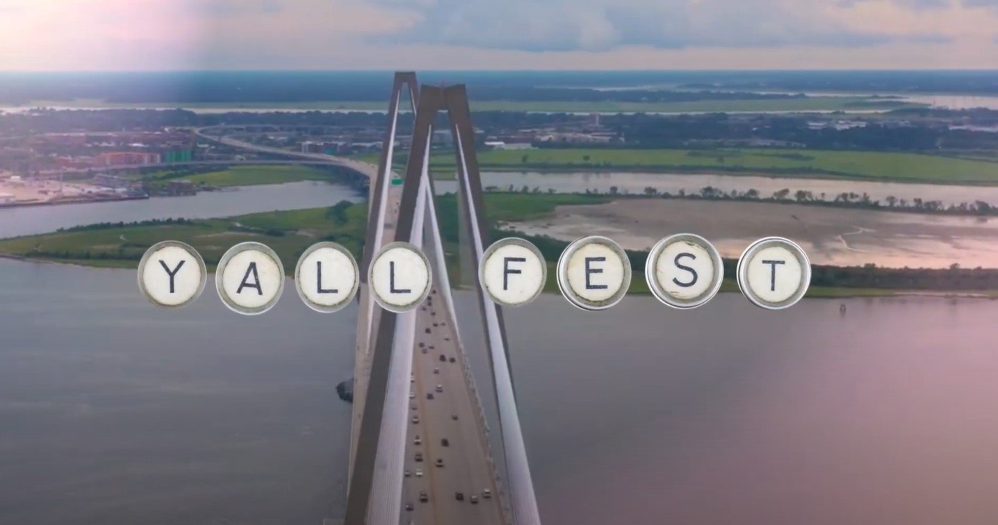
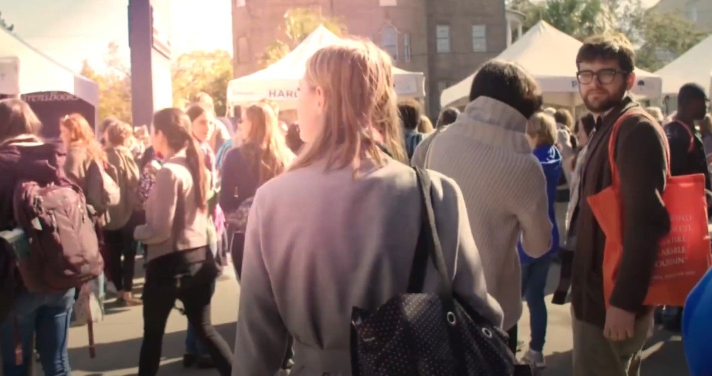
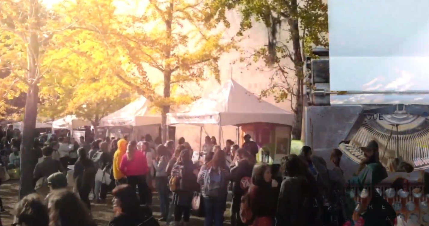
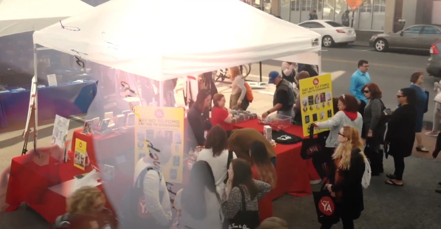
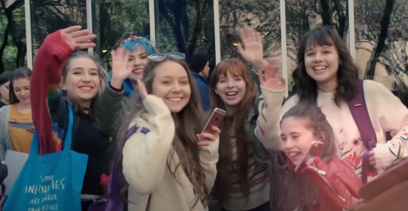
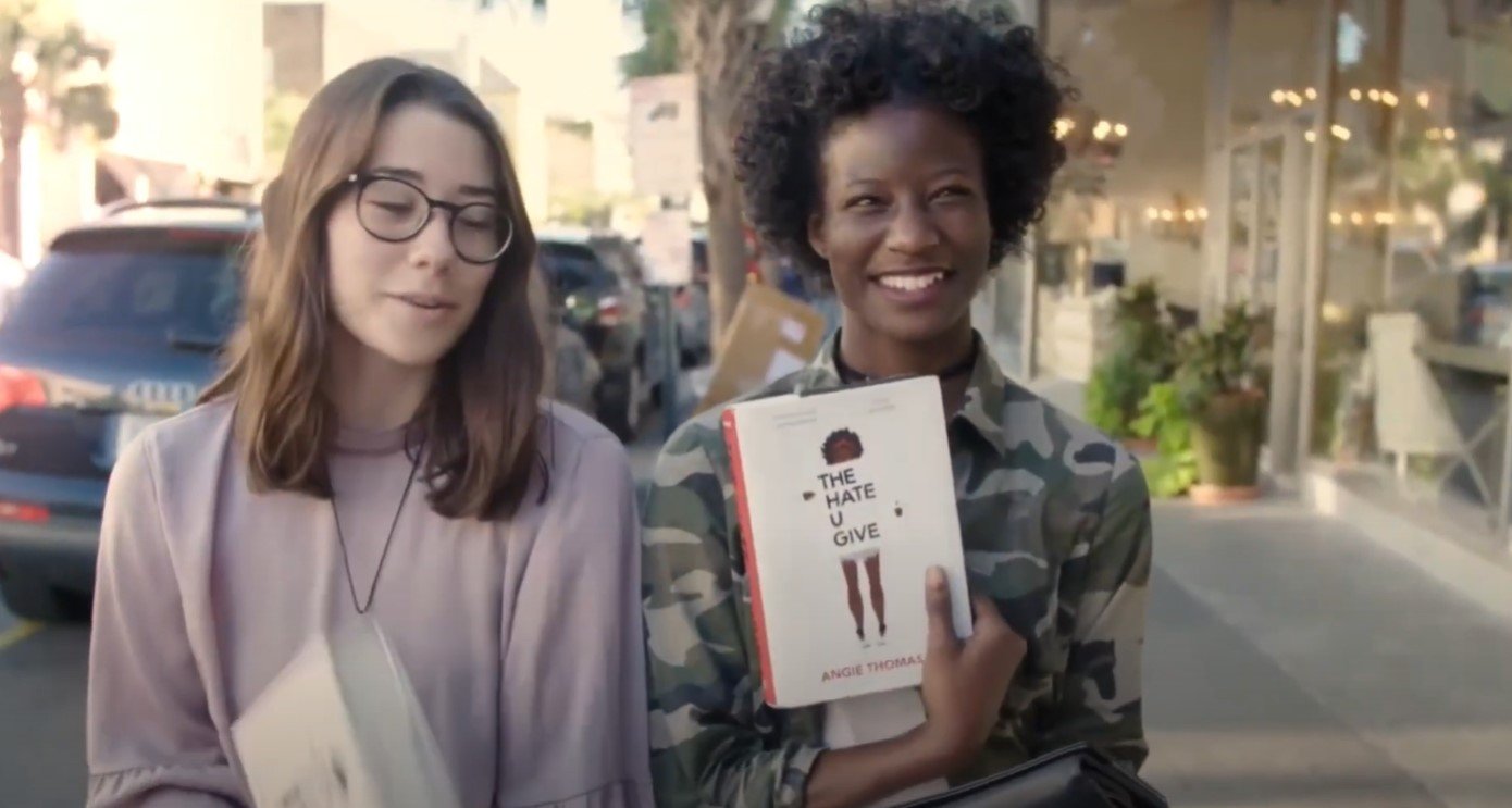
Exploring the evolution of writing methods throughout history, weaving them seamlessly into the festival's celebratory narrative. The transitions will be illuminated by dynamic light leaks, capturing the essence of overlaying elements inspired by the poster. This layering not only connects the visuals but symbolizes the continuity and interplay of creativity across time, all tied together in the vibrant energy of the festival theme.